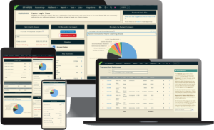
On the right-hand side of the Dashboard are three different charts and graphs. These provide a visual display of the data in your database. If you use a customized dashboard, be sure to include these sections in the customization.
Receipts By Budget Category
This pie chart contains all of the receipts entered into your database and organizes them by Budget Category. They are separated by dollar amount so that you can see where you are spending the most and least amounts of money in your campaign. There is also a checkbox that you can tick on or off that will either include or exclude Inkind contributions with this data in the pie chart. Clicking each pie slice will direct you to the Transactions report for that specific Budget Category piece.
Disbursements By Budget Category
This pie chart contains all of the disbursements entered and organizes them by Budget Category. Additionally, this chart will organize the data by the amount of each disbursement so that you can keep track of how much of your budget is going to each area. Clicking each pie slice will direct you to the Transactions report for that specific Budget Category piece.
Cash on Hand Over Time
This line graph will show a timeline of your cash on hand. The X-axis of the chart will show the amount of cash on hand and the Y-axis of the chart will show the monthly timeline for your cash on hand.